Chart catalog#
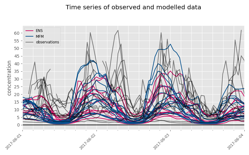
Time series#
Observation and simulation time series can be drawn with
plot_time_series
function.
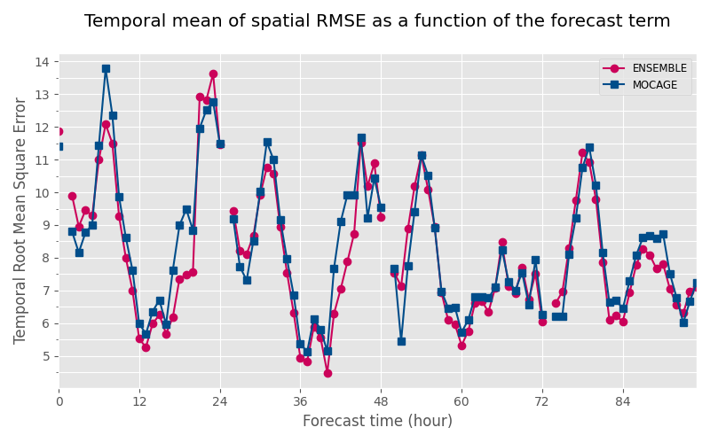
Average of a score as a function of the forecast time#
The score can be computed spatially (for each time) or temporally (for each station) and then average (mean or median) to get a value for each forecast time.
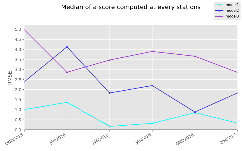
Median scores for each year quarter#
Median of scores computed every quarters can be drawn combining
quarterlyMedianScore
method and
plot_quarterly_score
function.
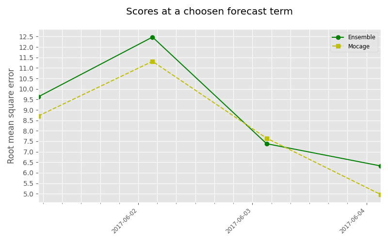
Time scores#
Scores at a given term can be drawn with
plot_time_scores function.
For hourly series, the term is a interger corresponding to a forecast hour,
whereas for daily series, it corresponds to a forecast day.
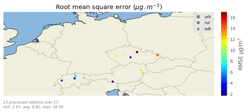
Station scores#
Scores per station for a choosen forecast day can be displayed on a map with
plot_station_scores
function.
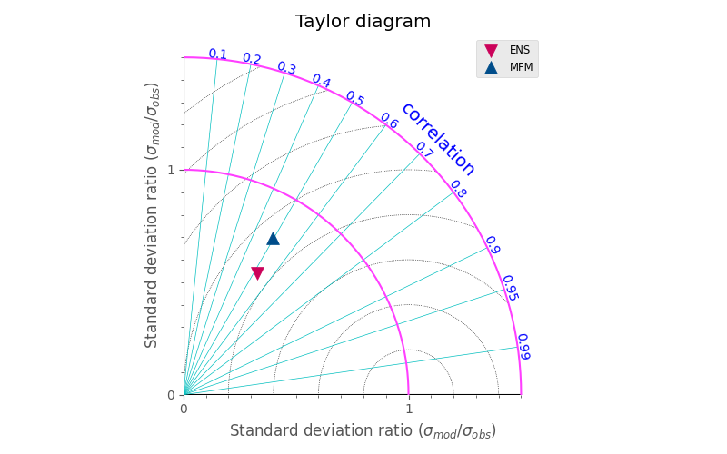
Taylor diagram#
A taylor diagram for the first forecast day can be displayed with
plot_taylor_diagram
function.
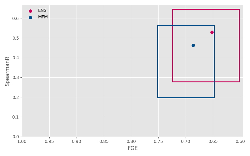
Scatter plot of score quartiles#
The function
plot_score_quartiles
draws a scatter plot with axis corresponding to the median of two choosen
scores. Each point on the scatter plot represents one model and the rectangle
around the point is drawn from the quartiles of the two scores.
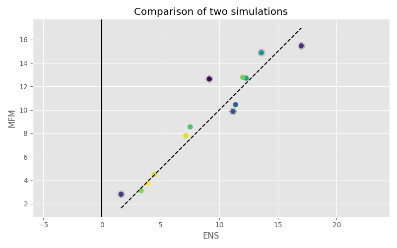
Scatter plot of station scores for two models#
The function
plot_comparison_scatter_plot
displays the score calculated at every stations for two different Evaluator
objects.
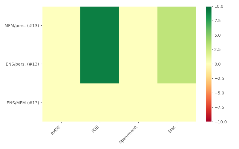
Significant differences#
The function
plot_significant_differences
tests the significativity of differences between the distribution of station
scores of two Evaluator objects. Several scores an several couple of
Evaluator objects can be tested.
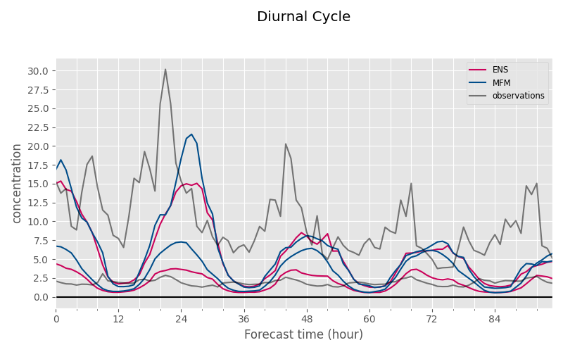
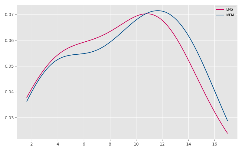
Diurnal cycle per station#
The function
plot_diurnal_cycle
displays the median of observed and simulated concentration values
at each station as a function of the forecast time.
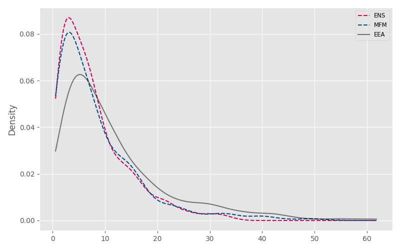
Probability density of raw data#
The function
plot_data_density
displays the probability density of observation and simulation values.
Probability density of a score#
The function
plot_score_density
displays the probability density of score values.
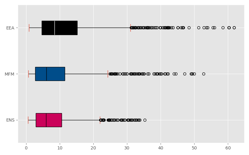
Boxplot of data values#
The function plot_data_box
displays the distribution of observation and simulation values.
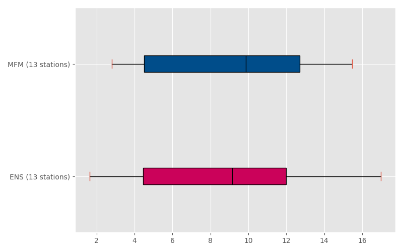
Boxplot of score values#
The function
plot_score_box
displays the distribution of score values.
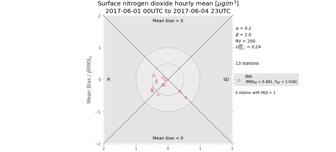
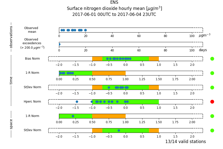
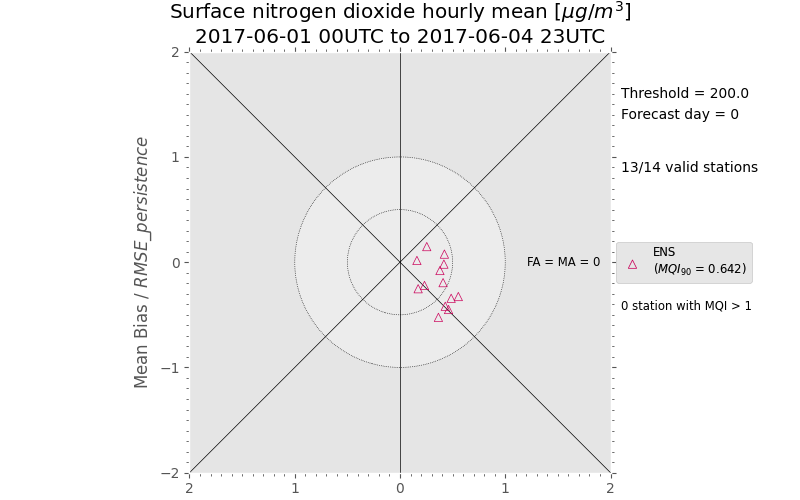
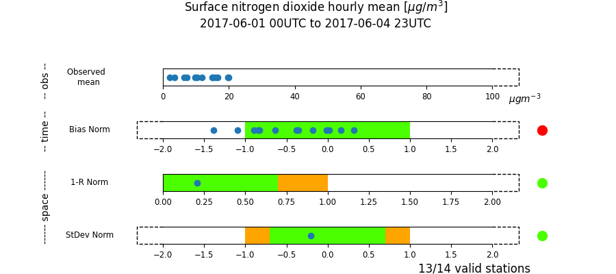
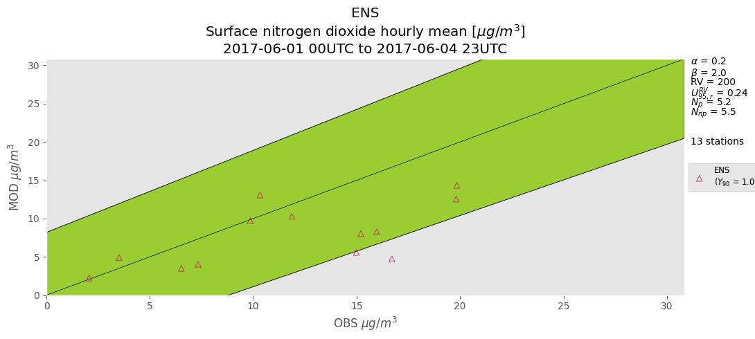
FAIRMODE diagrams#
The functions
plot_target_diagram,
plot_fairmode_summary
plot_forecast_target_diagram
plot_forecast_target_diagram
and
plot_forecast_target_diagram
displays five of the Fairmode diagrams: the assessment target plot,
the summary report, the forecast target plot, the summary report for
yearly average data and the scatter diagram for yearly average data.
A description of these diagrams can be found
on FAIRMODE website.
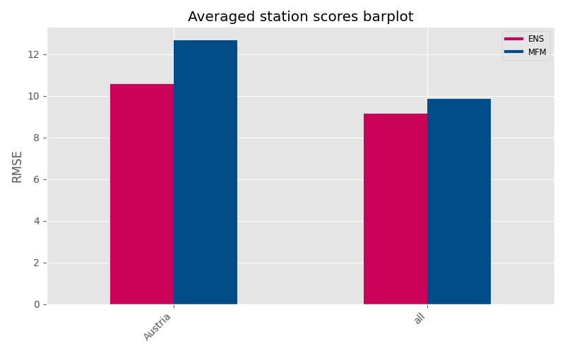
Scores as a barplot#
The function
plot_bar_scores
displays the barplots of the average of scores computed per station. It is
possible to compute different bars for different country sets.
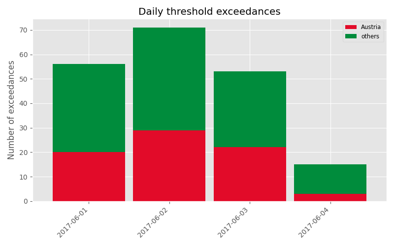
Threshold exceedances#
The function
plot_bar_exceedances
displays the daily number of exceedances.
It is possible to select different country sets.
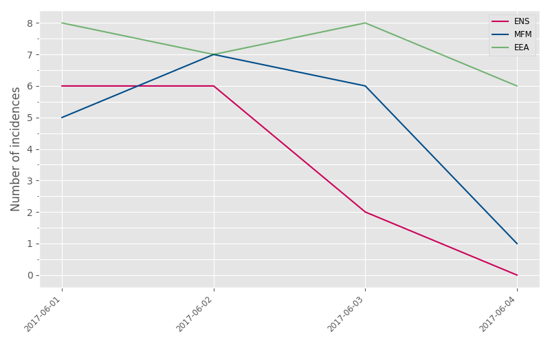
The function
plot_bar_contingency_table
displays, as a barplot, the contingency table regarding the number of
exceedances of a threshold.
The function
plot_line_exceedances
displays the daily number of exceedances.
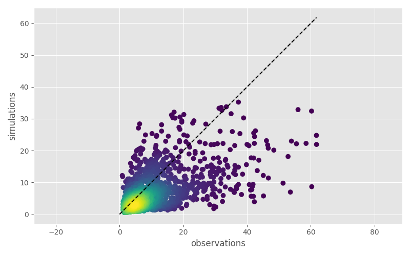
Observations vs simulations scatter plot#
Observation and simulation values can be compared with
plot_values_scatter_plot
function.
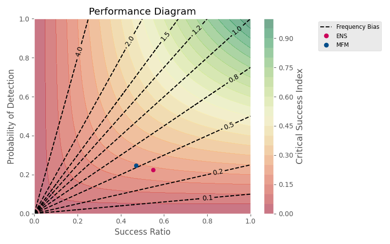
Performance diagram#
This function
plot_performance_diagram
draws the performance diagram by P.J. Roebber (“Visualizing multiple measures
of forecast quality”, 2009).
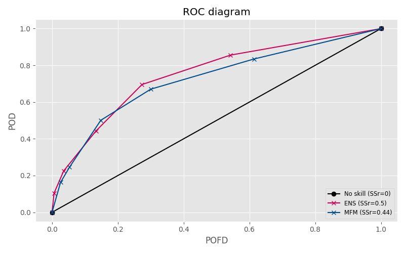
ROC curves#
This function
plot_roc_curve
draws the ROC curve relative to the choosen thresholds for each object.
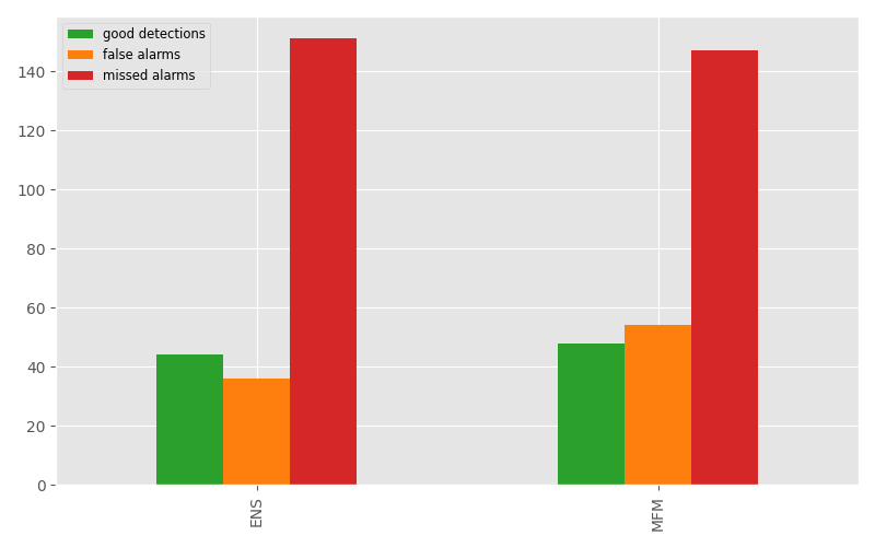
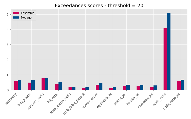
Scores computed from a concentration limit value#
The function
plot_exceedances_scores
draws a barplot displaying:
Accuracy
Bias score
Success ratio
probability of detection (Hit rate)
false alarm ratio
probability of false detection = false alarm rate
Threat Score
Equitable Threat Score
Peirce Skill Score (Hanssen and Kuipers discriminant)
Heidke Skill Score
Rousseau Skill Score
Odds Ratio
Odds Ratio Skill Score
More information on these scores can be found here https://www.cawcr.gov.au/projects/verification/.
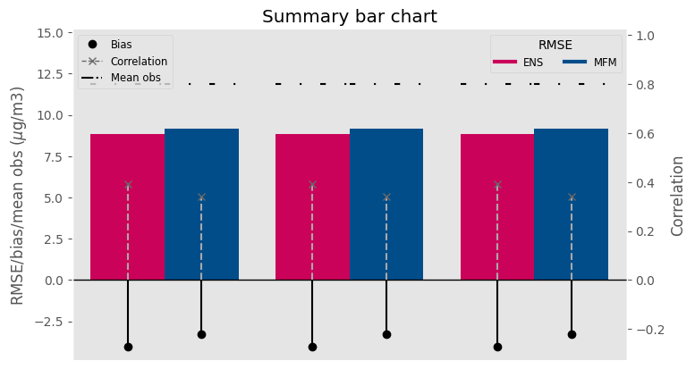
Summary bar chart#
The function
plot_summary_bar_chart
plots a bar for RMSE and lollipops for bias and correlation.
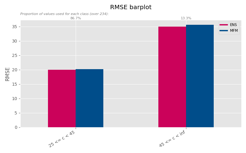
Bar chart of scores computed for different concentration classes#
The function
plot_bar_scores_conc
plots scores computed for each required concentration range (scores are
computed for each site and averaged).
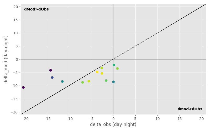
Dynamic indicators#
plot_dynamic_indicator_day_night
plot_dynamic_indicator_day_week
plot_dynamic_indicator_summer_winter